Case Study: Dashboard for Startup Businesses
TL;DR
I built Fundera’s first signed-in home experience for small business owners. This was a long-term, iterative project that will be the foundation for a signed-in experience for all Fundera customers and makes huge progress towards expanding our value as not just a loan marketplace, but a true digital finance partner.
The Problem
Fundera’s core product is really pretty simple: it’s an onboarding workflow designed to help customers start the business loan process. However, there are many customers who are not yet ready for a loan, and there are other products that Fundera offers besides loans.
This project has two goals:
- to continue to increase conversion and revenue to non-loan products; and
- to explore ideas and hypotheses about how Fundera can provide more value in the signed-in experience.
The User
For this project, my team and I focused our attention on a very specific segment of users: business owners who are not yet ready for a loan.
There are a couple reasons why users might fall into this segment: they have not started their business or started it recently (many of our lenders have minimum time in business requirements); or they may not qualify for loans due to their credit profile (business loans rely on both personal and business credit (did you know that was a thing?) and have much stricter credit requirements).

The Fundera team on an outing to Everyday Athlete, a climbing and athletic gym in Brooklyn.
Research
Once we identify that a user belongs to this segment within the existing loan experience, we hand the user off to a different experience that no longer shows available loans, but instead shows products that the user is more qualified for (such as business credit cards). That’s the experience I have been tasked with creating and improving.
When I first joined this product, the “startup” (non-loan) experience was a barebones, second-class experience. The user landed on a loan options page that had been retrofitted to show a selection of business credit cards they might be eligible for. There were a few issues with this:
- We didn’t give the user any context as to why they didn’t qualify for a loan.
- We didn’t give the user any information about why a credit card might be an alternative for them.
- We didn’t give the user any guidance on how to work towards being eligible for a loan.
- We didn’t have a home experience that we could encourage the user to return to and re-engage with.
That last point might even be the most important. Fundera has a very ambitious and exciting vision to be much more than just a marketplace: we want to be a digital partner to small business owners, and provide them with financial products as well as the advice and intelligence to make good financial decisions for their business.
These experiments are the very beginning of building a “dashboard” experience (I’m defining this as a signed-in home where a user can see their business financial picture and take action on it) that moves towards that second piece of the vision.
To that note, I started to think about this idea of a dashboard. What should our North Star look like? What information should it include? I came up with a lot of potential user stories for existing and aspiring business owners:
- I would like to know what do to do find capital to get my business started.
- I would like to know what my capital plan should be: what kinds, how much, and when?
- I would like to shop and compare capital options that are appropriate for my business.
- I would like to review and monitor my credit profiles, and see actionable highlights.
- I would like to see a checklist of actions I can take to qualify for a loan.
- If I am in the process of getting a loan, I would like to see my status, timeline, and any actions I need to take.
- If I already have a loan, I would like to monitor it: balance, payments, when I will pay it off.
- I would like to know when I should consider revising and refinancing my loan.
I also did some research into dashboard experiences in the SAAS world. I looked at business and finance tools (accounting, investing, HR, CRM, e-commerce), as well as plenty of platforms that weren’t anywhere near our space (social media, health & wellness, analytics, content, engineering, etc.). There were a few common threads that I liked:
- A high-level summary that emphasizes the information I need to know now and prioritizes the actions I should take (Shopify does a good job of this).
- A well-organized navigation structure that also teaches me about the product features available to me (Google Analytics is a good example).
- Helpful, trustworthy, and personable content and commentary (I love Intuit’s Turbo’s messaging).
- Clean and intuitive patterns of showing data: graphs, tables, and timelines (Headspace, Betterment, and Typeform are all beautiful).
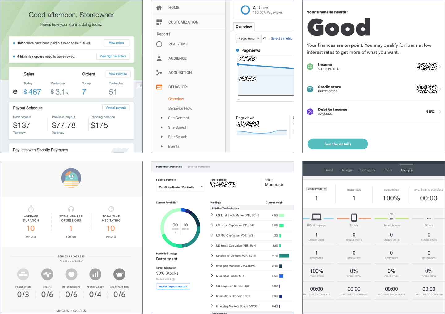
Screenshots of other dashboard features I liked: Shopify, Google Analytics, Turbo, Headspace, Betterment, Typeform.
Based on all this information, it was clear that we had a lot of blue sky to start exploring.
Exploration & Iteration
Once we had wrapped our head around the problems, landscape, and goals of this experience, we broke the project up into a few different phases so we could isolate and test different hypotheses.
Hypothesis 1: Being transparent and informative about users’ capital options will increase conversion.
For this first phase, we focused only on the copy in the existing experience. What if we simply rewrote everything to give users better guidance? After all, these users came to Fundera expecting to get a business loan, and we could not fulfill that promise. Therefore, they are likely to be confused and frustrated about their experience.
This is the "dashboard" I started with. This first test wouldn't touch the design (yet!).
I wrote a copy brief so the content team knew the direction we wanted to go, and then worked with engineers to split test the new copy against the existing copy. This test ran while we were working on the next phases. After it was finished, it gave us about a 9% increase in conversion, which we defined as taking action to sign up for a business credit card. It wasn’t a huge jump, but it validated that we were headed in the right direction.
Hypothesis 2: Checking the user’s credit profile will allow us to provide better recommendations, and increase conversion.
If users don’t have the credit profile to qualify for a loan, do they have the credit profile to qualify for a business credit card? In the user research we did, we found that the biggest hesitation about choosing a card was the question, “Will I be approved?” The previous experience provided some general context, but it didn’t give the user any information about where they currently stood so they could make an informed choice.
Fundera had previously built a way for users to check their credit score with a third-party provider. So I set out to include that “verification” process in the dashboard which allowed two things: 1, we could show the user their credit score, and 2, the system could adjust our credit card recommendations to exclude cards that the user probably wouldn’t qualify for.
This dashboard-lite focused more on the user and the job that Fundera could do for them.
This test had more mixed results. On the one hand, 41% of users started the verify process, and 17% finished it (impressive given that we ask for a social security number). We also saw that 62% of users took action on the new page (whether verify or sign up for a card) vs. 27% in the control. But on the other hand, overall revenue dropped significantly (about 75% – yikes). This was unfortunate, but not unexpected. We increased the conversion funnel from one step to seven steps, asked the user to provide sensitive personal information, and stopped promoting some of our best products to users who didn’t qualify for them. From these results, we decided our next step would be to improve our advice.
Hypothesis 3: Providing both personalized context and actionable information will increase both conversion and engagement.
We tried giving users context, and then we tried giving them actionable information, but we hadn’t tried the two together yet. This phase was meant to combine learnings from the two previous experiments, as well as push the dashboard structure even further.
As I thought about the types of information we wanted to provide, I came up with three categories:
- “Mirror” or status: credit scores, loan and bank balances, revenue information.
- Recommendations or actions: build business credit with a credit card, review your spending to take better advantage of rewards.
- Passive advice: spotting trends on a credit report, providing guides for new business owners.
I also wanted to create a logical information architecture for the dashboard, so that users can start to understand where to go for particular types of information. This involved thinking about levels of detail we provide. I wanted the dashboard to be informative but not overwhelming. I created a summary of that content that included high-level status (credit scores and time in business), one prioritized action to take (verify credit scores, same flow from before), and a preview of other tasks that should come next.
Now we have a proper dashboard, with plenty of space to add more features and tools.
One route I tried that did not end up working out was the idea of a combined status and navigation. I was struggling to find a way to connect the data we were showing (e.g. a credit score) with the action that should be taken, so I created a combined data table and navigation. I ended up scrapping this idea, as it was confusing for users because it worked like a navigation, but it didn’t look enough like navigation. We ended up deciding as a team “well, why don’t we just build a proper navigation?”
The results for this phase were similarly mixed, given that we had some similar constraints. However, there were some great indicators that we were on the right track for engagement. More users started the verification flow, which makes sense given its increased prominence. And after finishing verification, 70% of users continued to explore the dashboard, spending an average of 4 minutes browsing around.
An interesting outcome from the results was that we ended up changing our test/iterate plan to be bigger than revenue alone. Revenue had decreased again in this test, but since the experience metrics were so positive, we decided to build features that provided additional revenue opportunities instead of trying to push users to onboard, engage, and convert all in one go.
Hypothesis 4 and beyond: Building additional features will increase the value we provide our users, and create more opportunities for revenue.
Now that we have a dashboard that is successful at giving users a reason to re-engage with us, we have built several features that continue to push that farther.
Some current and planned features:
- The ability for users to monitor their credit scores over time. This combines with an email campaign that shows how their credit scores have changed since the last time they checked, and what actions they should take.
- An experience to browse additional financial products. The prior versions of the dashboard only surfaced one recommendation for each category so as not to overwhelm users, but we have now added the option to browse every product we offer.
- A standalone credit score monitoring service. We can now promote this value on its own, and sign up business owners who aren’t ready for or interested in a loan. This is actually the first product to introduce the concept of a Fundera customer who isn’t a potential borrower.
- Streamlining the signup and verification process. How might we reduce the amount of effort required from the user to show them the information that matters to them?
- A tool that analyzes a business’s spending data and can calculate the best way to maximize credit card reward programs. This is basically free money for business owners, and I can’t wait to ship this.
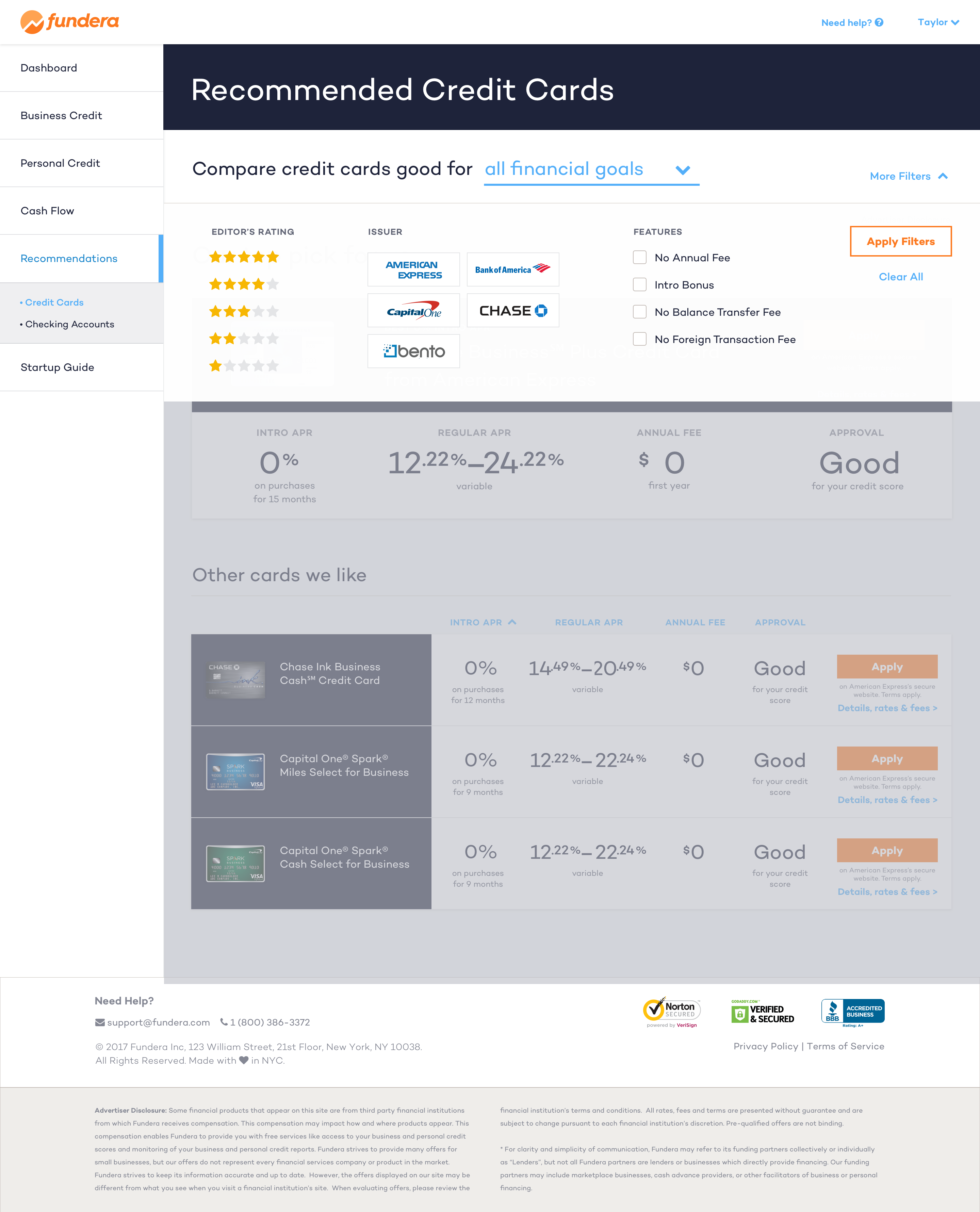
One new feature I worked on was a "shopping" experience for business credit cards.
Each of these features adds an additional opportunity for users to convert to products at any point in their journey, which provides a more organic experience for them and a more focused approach for us.
Implementation
Since we broke this project down into separate phases for each hypothesis/feature, we were able to break up the work into small slices too. Each phase involved an ideation/wireframing/prototyping cycle, one or more rounds of usability and comprehension testing, time for visual design polish and mobile adaptations, and pairing with engineering to create specs and do QA reviews.
We had an interesting challenge for both design and engineering on this project. It was a big step to start thinking about the dashboard as a framework, rather than a series of pages. I spent some time wireframing out how the future features above might live in this dashboard experience so we could cover as many use cases as possible. I didn’t want to build out too much since we pivot and adapt features as we learn, but it was helpful for the team to be able to picture the long-term vision of the experience.
I also looked at the usability testing I was running in each phase as an opportunity to help flesh out the personas of our user (always be scrappy!). I tacked on some additional questions to each unmoderated test so I could answer some of the more ethnographic questions I had about business owners and their finances.
In particular, there was a lot I discovered about their behavior around credit cards that is valuable for the spending tool we are building now. For example, there are definitely business owners who simply use credit cards as a convenient way to manage payments and spending. This means we have a huge opportunity to promote the value of a tool like this.
Takeaways
This project is one of the biggest new undertakings for the Fundera product, and it’s started us down the path towards one home experience for our customers that is made up of personalized data analysis, capital options, and holistic advice. It’s also especially impressive how far we’ve gotten in the four months since we first started it. And because of what we learned in these initial phases, Fundera now has a plan on the roadmap to expand and refine this dashboard for all customers, not just non-loan users.
I am particularly proud of designing and building Fundera’s first dashboard/hub/portal/experience/whatever-you-want-to-call-it. We now have a framework in place that allows us to add new features and products, and sets us on the path to be that digital partner.
One of the most interesting and inspiring parts of what we do is to hear people talk about how their business is one of their life dreams. What we do is so important to helping our customers achieve those dreams and I’m incredibly proud to be able to contribute to that.
All information in this case study reflects my thoughts and does not necessarily reflect the views of the company. To comply with my non-disclosure agreement, I have omitted and anonymized confidential information.