Case Study: Advisor Matching Service
TL;DR:
I created a system of workflows to match up Betterment's individual customers with investment advisor partners. This project spanned the end-to-end experience including customer- and advisor-facing tools and all commmunication touchpoints.
The Problem
As part of our new advice offerings, Betterment partnered with select advisors to form the Betterment Advisor Network program. These advisors needed a way to set up a partnership with matched Betterment customers so they could provide advisory services.
The User
The advisor side of the business is unique in that there is a primary user — the advisor, and a secondary user — the client.
The advisors in this program were tech-savvy CFPs, who were already on the advisor platform with clients that were similar to Betterment’s demographic.
The clients in this program were people who were already Betterment customers — also tech-savvy, and who understood the value of using technology to improve their investment capabilities. These customers were looking for additional services that weren’t part of Betterment’s offering: a personal one-on-one relationship and more holistic/complex financial plans.
Research
Because of this desire for one-on-one service, this process starts with a phone call — the customer speaks with an advisor specialist on the Betterment team to talk about their needs, and the specialist recommends advisors that we work with who fit those needs. I listened in on some of these phone calls to learn what goes into making the match. It helped out a lot that the two users we were building this feature for were people we already knew a lot about.
I realized this feature would need to bring as much human touch as possible to the back-and-forth flows in our system.
I focused my research on the current advisor/client relationship onboarding process to make sure that this feature would fit in and not make things more complex for either advisors or customers.
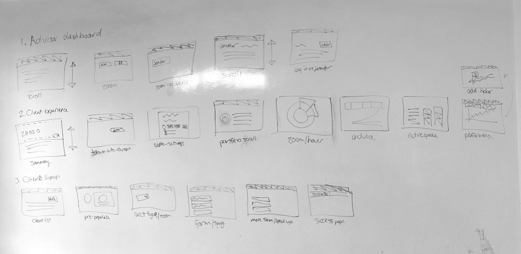
The first step here was to look at the existing state of the world in advisor onboarding. I mapped out all the steps that the advisor and client go through to sign up which gave me a good idea of where this flow would fit in most efficiently.

A rough map of the steps for signup on both the customer and advisor sides.
Once I had a plan for where this would fit in, I spoke with the business development team and collected a list of their requirements.
After I had an idea of what information we needed to provide and collect, I came up with a list of user goals that this flow needed to solve:
- As an advisor, I want to see a list of potential clients who have been referred to me by Betterment.
- As an advisor, I want to be able to confirm (or decline) the partnership with a client by sending my legal agreements for the client to review and accept.
- As a Betterment customer, I want to be able to review the agreements and accept to proceed with the partnership.
- As a Betterment customer, I want to feel like I am receiving personalized, human service from my advisor through this process and when I request it going forward.
Exploration
I came back to the larger team with the list of goals, and once everyone was on board, I started mapping out the steps on both the advisor and customer side within the existing systems. As it turns out, there is a lot of back and forth happening (yikes!).

Process flow map for both customer and advisor. The highlighted steps are the new flows I was inserting.
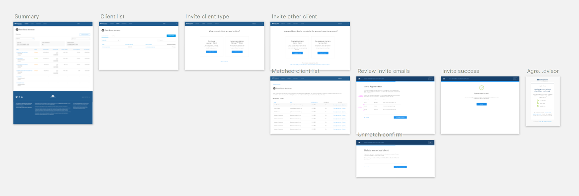
For advisors, the most important thing was making that list of clients easy to find and easy to review. One thing we know about advisors on our platform is that they already know how to invite a customer. There is an ‘Invite Client’ button on their dashboard that gives options to bring on a new client. Since this is familiar, I dropped in a step here that would also give the option to add a referred client.

An overview of the whole process on the advisor side.
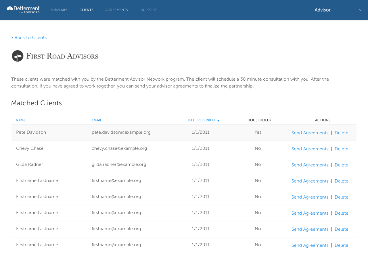
Next, I created a table that would list out matched customer information with an option to send out agreements (as well as delete the client if the match wasn’t appropriate).

The client match table.
One thing I had to consider when thinking about how the advisor would find these clients was customer privacy. Initially, I thought providing a search feature to advisors would be easy to use, but we realized that it could potentially expose personal information for non-advisor customers. So the second choice was to restrict it to a list of only the customers who were matched to the advisor. The experience wasn’t quite as good, but customer privacy won out in this case.
For customers, I didn’t have to worry about a central location since it was a one-time request pushed out from the advisor. The customer would receive an email that would take them directly to the partnership flow where they could review and accept the agreements.

An overview of the whole flow that a customer goes through.
The most important thing that I wanted to emphasize to the customer is that they now have a person that they can form a relationship with. So I used the advisor’s name and photo wherever I could to underline this fact.

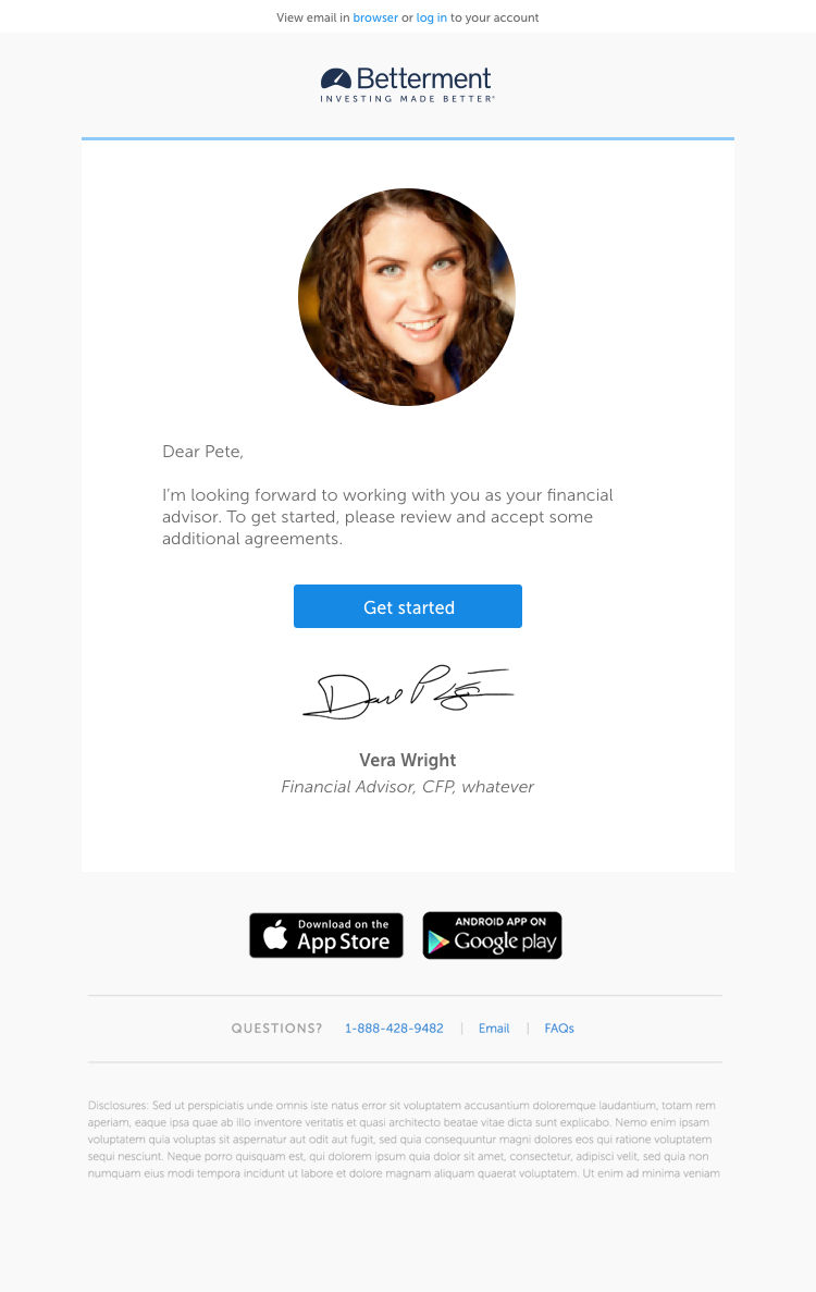
The customer first receives an email which was designed to look like a personal note from the advisor that was matched to them.
Validation
Testing for this flow was pretty simple — each type of user had a pretty linear path, so I did internal testing with some of our in-house advisors and other team members who were not involved in the project.
I used InVision to set up a few prototypes to run by the team along with some basic test goals. For the advisor flow, the goal of the test was to successfully find matched clients and initiate a partnership by sending agreements. For the client flow, the goal was to accept the agreements.
Internal testing is risky because the team knows way more about the product and finance than our target users, but it’s a very efficient way to get quick feedback.
Implementation
Once I was satisfied that there wasn’t any confusion in either flow, I started prepping everything the engineering team would need to build them out.
These flows included a couple new components that first needed to be included in our style guide. I worked with the engineers on design, responsive requirements, and code review to make sure they would be shareable across teams.
Iteration
One complication that came up during the build process was the fact that Betterment customers aren’t always single clients. We have joint accounts and other features that connect customers together, which means they all must agree to the same legal terms.
I went back to insert additional optional information into both flows if these groups existed, and then worked with engineers to make sure match emails were triggered for all members of the group.
Takeaways
This tool ended up being fairly simple from both the advisor and client side, but there was a lot of work that went into making it that way. It was also a challenge to make this process feel as human as possible. But I think that was the most important part because, after all, the customer is asking for an advisor because they want a more personal touch.
All information in this case study reflects my thoughts and does not necessarily reflect the views of the company. To comply with my non-disclosure agreement, I have omitted and anonymized confidential information.