Case Study: Healthcare Dashboard UX Audit
TL;DR:
I worked with an early-stage healthcare startup to audit their current MVP product and guide their future design strategy. This was a freelance project that was meant to give the team an actionable way to integrate good design into their product roadmap to improve the user experience over time.
The Problem
Wellsheet is a workflow plugin that integrates into some of the largest Electronic Health Record platforms (such as Athena or Epic). It extends the EHR’s feature set to optimize a care team’s productivity with better data, more efficient UX, and more actionable insights. A former colleague is one of the founding team members and asked if I would consult with them until they had dedicated design resources.
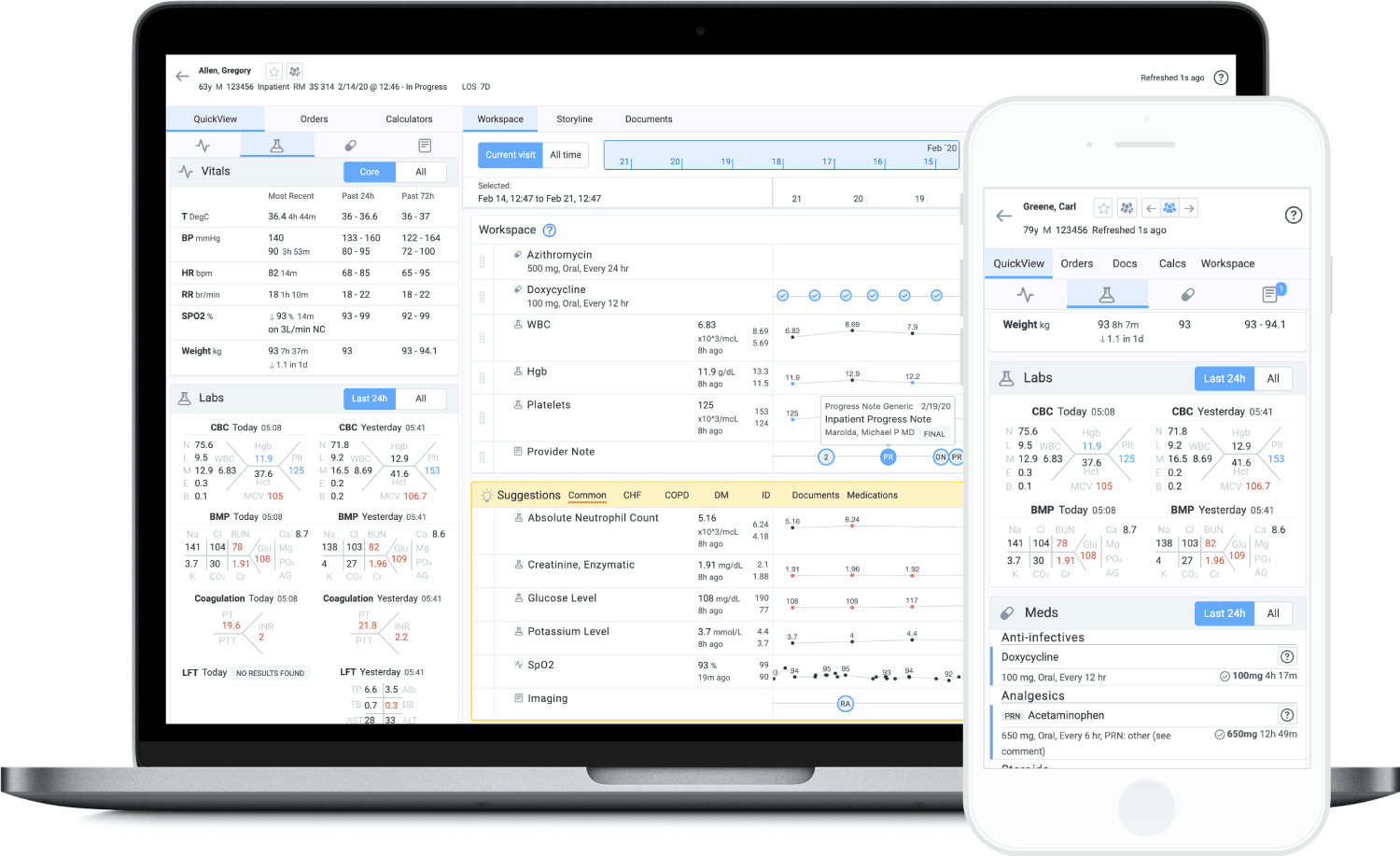
Wellsheet's current MVP that takes EHR data and organizes it into a more efficient dashboard so users can better understand the full picture of their patients' health.
Wellsheet has an MVP set of features that are being tested with selected physicians. My job was to validate that by improving the usability and design of the product, the next version will improve the satisfaction of current users of the product and will be more compelling to prospective clients. Over a week or so, I absorbed as much information as I could and synthesized it into an actionable design roadmap.
There were four main components to this project:
- Evaluation of the current state and limitations of the product
- Research that defines the target user of the product
- Analysis of problems and pain points that users experience
- Recommendations and next steps for addressing those problems
They needed an overall understanding of their they were, design-wise, and recommendations for the future. This included an audit of current product systems, analysis of users and their behavior, brand and visual impressions, competitive review, and a recommended roadmap for design. This all culminated in an in-depth UX report, in both documentation and presentation format, that they could use to plan their design strategy going forward.
The User
In any healthcare practice, there are many types of users that interact with the EHR constantly throughout the day. For Wellsheet, it was important to segment them into two categories:
- Primary personas: These personas reflect the current Wellsheet user base. They are the users that we are currently targeting research and product development towards. These are mainly doctors, as they have the most ownership over a patient’s care and are likely the decision maker at a practice.
- Secondary personas: These personas reflect additional personnel that our primary personas may interact with. These users are not currently a focus for product development, but may be considered as users for future Wellsheet improvements. These are other folks on a patient’s care team such as specialists, medical assistants and nurses, or administrative staff.
Research
Wellsheet had previously done some basic user research, but I supplemented their knowledge in a few ways:
- additional interviews to fill in some gaps in what the understands about their users
- existing and new research synthesized into user personas and actionable insights
- research into the product itself by auditing and mapping the current state
With this information, I defined a set of high-level user goals to reflect on as part of building new product features.
Some example goals for our primary personas based upon the research thus far:
- As a doctor, I need to be able to review and act on patient data in order to provide them with the appropriate care.
- As a doctor at the beginning of an appointment, I need to bring myself up to date with the patient’s care plan – both recently and specific to the condition they are visiting for.
- As a doctor during an appointment, I want to see recommended care options for the patient’s condition.
- As a doctor during an appointment, I need to be able to order tests, medications, and other follow-up care for the patient.
- As a doctor after an appointment, I want to be able to summarize and record the patient visit and any changes to their status.
Now that we had an idea of what the user is trying to accomplish, Wellsheet can use these goals to inform their product roadmap and ensure they are working on the most impactful things.
Exploration
Once I had absorbed as much information as I could, I started digging into the product to understand how it works and how users interact with it.
When Wellsheet is launched from the EHR, it pulls patient data into its own customizable dashboard and workflow UX. Users can view a patient’s health history, treatment information, and take treatment actions. The goal is to display existing EHR data in a way that makes it easier to gain insight and make decisions about the patient’s care.
Auditing the current architecture
The first step was to understand the product’s information architecture by reviewing every screen and workflow:
- What patient data is surfaced?
- What are the different ways the data can be viewed?
- How does the user navigate around the product?
- What actions can the user take?
From this audit, I built maps showing how that data is organized and how the user navigates around. I also put together a set of sample wireframes to illustrate how the architecture could be better organized.
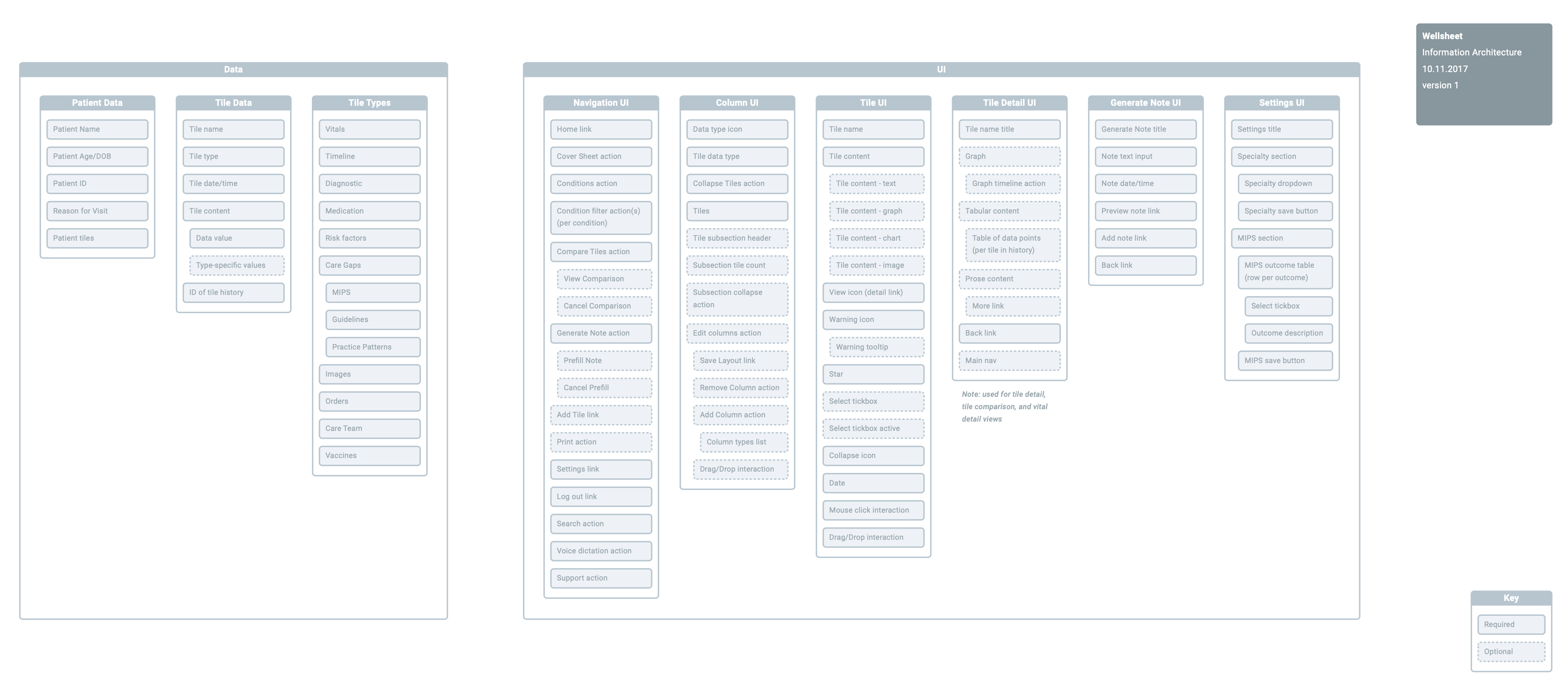
Information architecture (IA) focuses on organizing, structuring, and labeling content in an effective and sustainable way. The IA map lists the types of data in Wellsheet and how that data is currently structured.
Auditing the visual design
Next, I went through the product again with an eye to visual design, UI interactions, and consistency. Wellsheet’s initial version was built without any thought towards consistency in typography, color, or interactive components. I put together a document showing the wide variations in these elements so the team could see them all together and understand how these inconsistencies were compromising the UX. I included UI and style guide recommendations in my report.
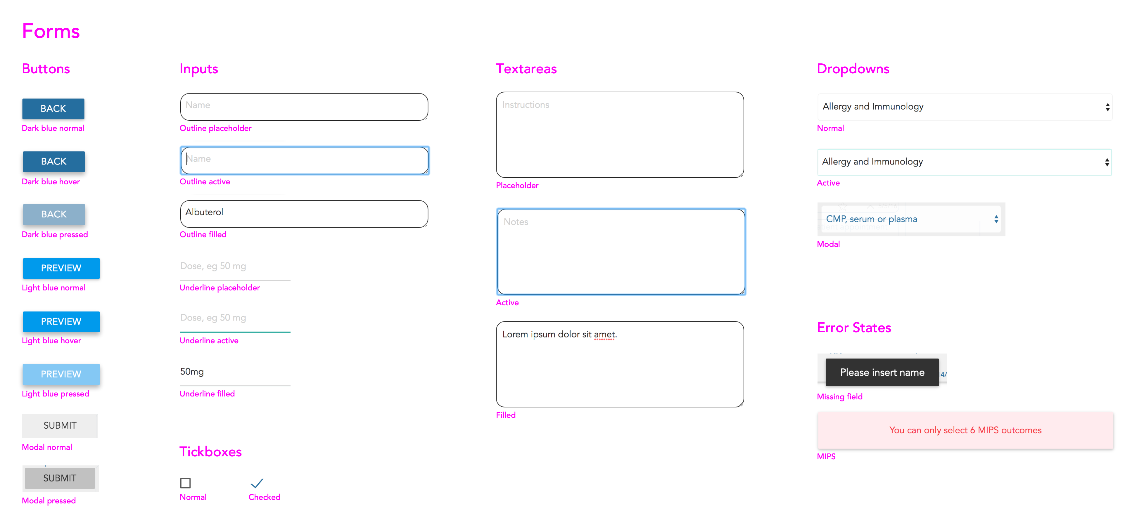
A visual audit is a method of combing through an interface for stylistic consistency. This is an example showing an inventory of all the form elements currently in the Wellsheet product.
Identifying problems and solutions
Having a better understanding of the target user and a mental model of the existing product, I started identifying design and UX problems and brainstorming solutions.
A few examples of problems I spotted:
- The current system only provides a limited number of ways to filter data, and it’s unclear to users how they work or differ.
- Doctors enter a lot of data, and Wellsheet doesn’t surface that information in a helpful way.
- Wellsheet does not have a well-defined set of visual elements, and there are inconsistent variations of the same element in different places.
- There is little distinction between UI elements with different behaviors – some elements look visually consistent even though they have very different actions.
- When a user performs an action, there is no feedback that the system has received that action successfully and is processing it, or if there was a problem.
- The current system of organizing patient data isn’t well aligned with how doctors work, and doesn’t do a good job of telling the patient story.
An example solution to this last bullet point:
- Determine a logical information hierarchy – For the main dashboard, we did this by an internal card sorting exercise. Using those results, I was able to sort the information into four levels:
- Doctor information. This is the set of controls and options that pertain to the logged in user.
- Patient information. This is the demographic and status information of the current patient.
- Filtering navigation. This is the interactive menu of different ways that a doctor can view the patient’s historical data. These controls affect what data is shown in Level 4.
- Filtered patient data. This displays the subset of patient data that is relevant to the actively selected filter in the Level 3 navigation.
- Improve navigation functionality and flexibility – The power of Wellsheet is in its data filtering capabilities. We need to give users an easy to use way to explore and change how they view patient data.
- Surface and prioritize patient data – Along with expanding the filtering capability, we also need to display the filtered data in a way that is useful for the doctor.
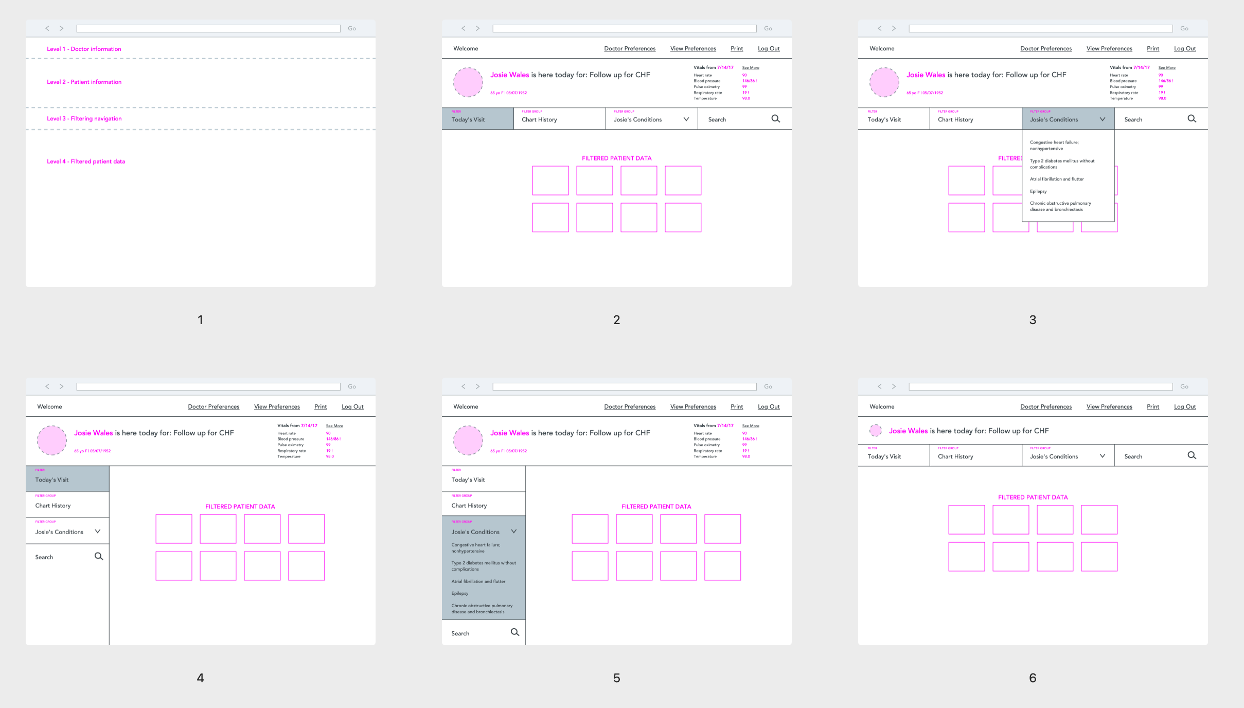
These wireframes show my thoughts on reorganizing the IA and navigation to help users get a better picture of the patient's story.
I identified a lot of low-hanging fruit like this that would require very little investment but would have a huge payoff in the user’s experience. These are all very simple UX best practices, but the Wellsheet team didn’t have anyone responsible for taking these kinds of things into consideration.
Deliverables
There were really two things that came out of this project – the recommendations, and the documentation. The majority of the work on my part was boiling all the information I gathered into an analysis of the current state, problems and gaps, and recommendations for the future. However, the team also needed a way to use this analysis so the written documentation was just as important here.
Analysis
I believe the most valuable outcome of this work were the synthesized themes and recommendations. I identified four main themes that Wellsheet could use as guiding principles for their future roadmap:
- Personalization and context awareness – A user-friendly system will give control to its users by personalizing information to the user’s contextual situation, and by allowing the user to customize that information to their preferences. By improving the contextual awareness of the system, we can give users more useful and actionable information.
- Organization, navigation, and findability – A good information hierarchy allows users to locate the information they need as well as identify the actions they need to take to accomplish their goals. By improving the organization of the product, we can provide users with the right information at the right time.
- Consistency and standards – Visual consistency can increase a user’s understanding of how to use the product. By creating a well-defined system of UI elements, we can give users cues of what actions they can take and what the results will be.
- Interaction feedback and error prevention – When a system doesn’t react to user actions in a timely or familiar way, the user can’t tell what is going on behind the scenes. By creating good interaction patterns, we can enable the UI to show the user what actions they can take and when to prevent uncertainty.
Within each of these themes, I provided a summary of the problems and solutions I found and several recommendations for how to improve the product and projects that could be added to the future roadmap.
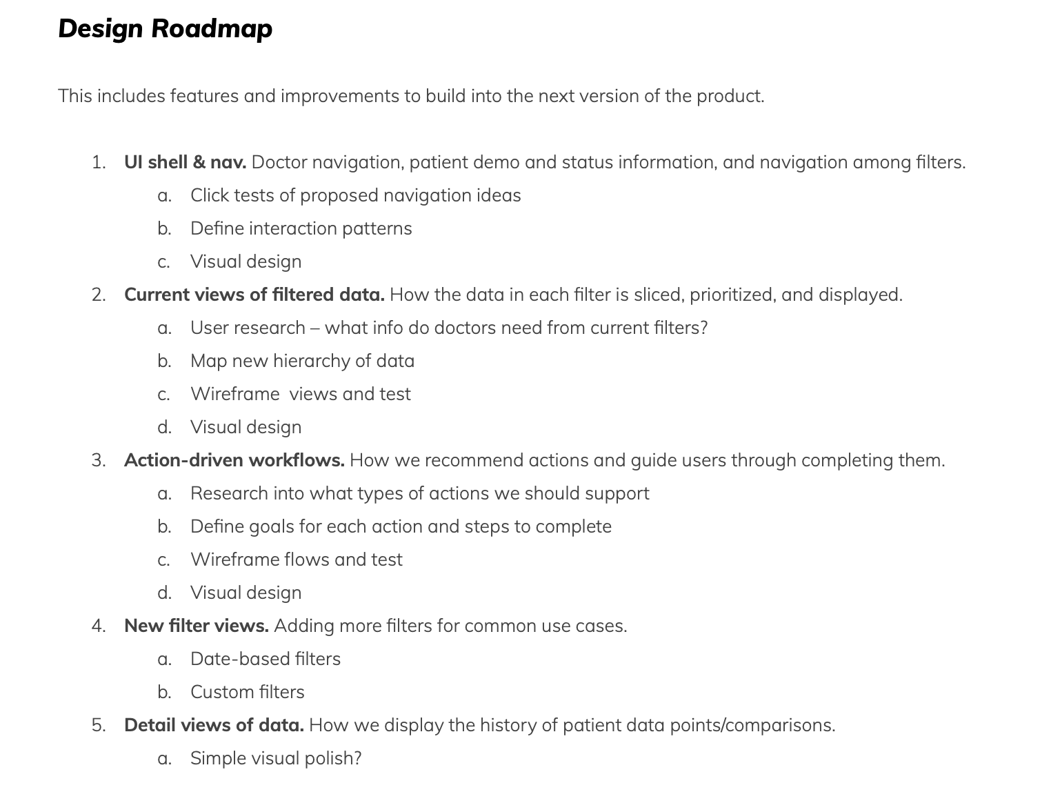
I even organized all this into a sample roadmap that gave examples of how these improvements could be broken down and prioritized to tackle the problems iteratively over time.
Documentation
The physical output for this project was broken down into two main deliverables:
- A full UX report with my findings, insights, and recommendations, including supplementary documents like audits, maps, and wireframes.
- An in-person presentation of my findings, which was a high-level summary of what was in the report and provided time for discussion and questions.
Both these documents delivered similar content, but gave Wellsheet two levels of detail and two formats to review the information.
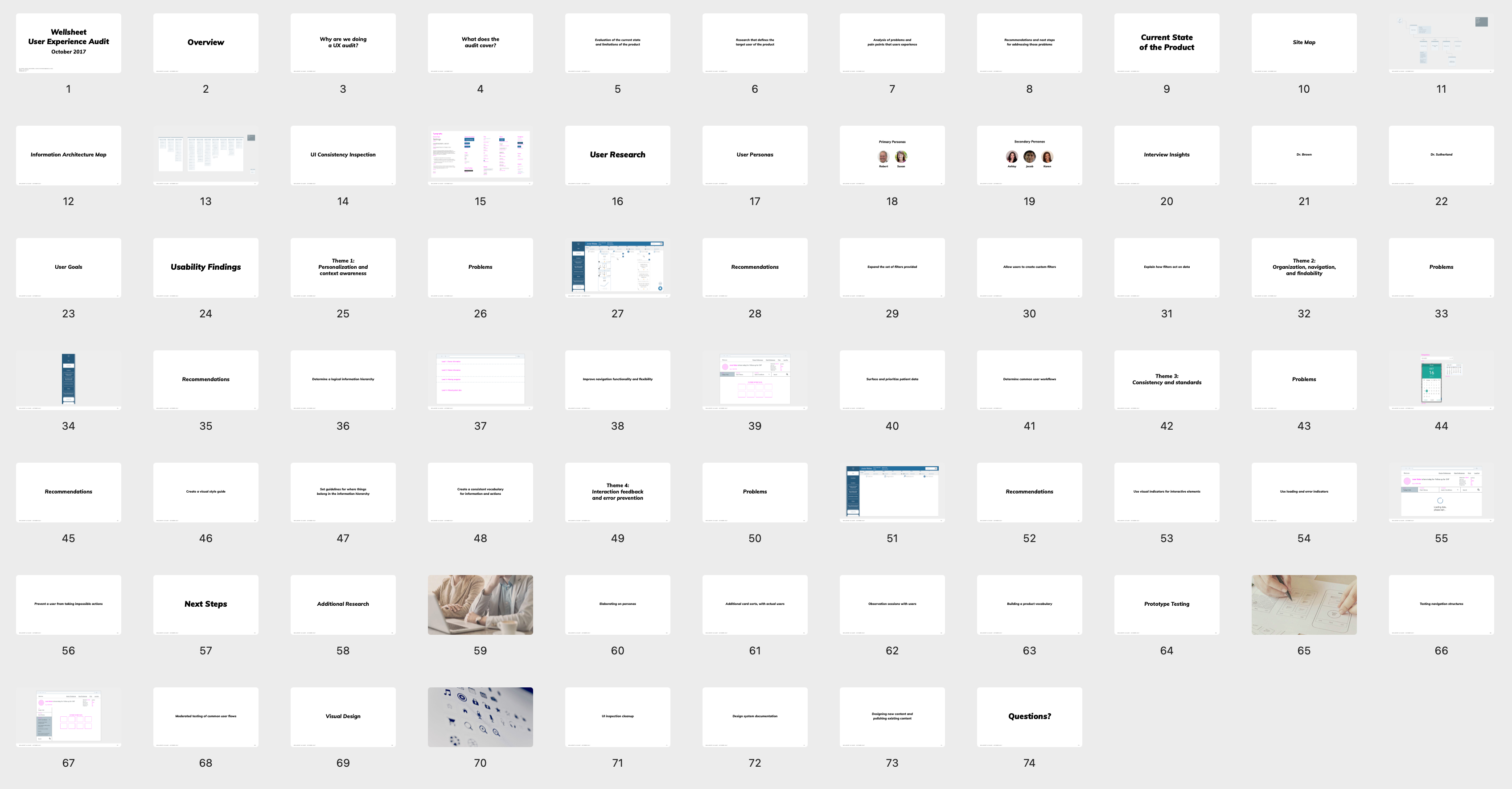
One of the deliverables was an in-person presentation of all my work and findings so I could walk the Wellsheet team through the process step-by-step.
Takeaways
I don’t take on many freelance projects, but this was a great opportunity to help an early-stage product evolve into a better experience for its users. I generally prefer to go deep into a product and spend more time iterating on design improvements, but I was pleased with the impact I was able to make by applying some simple auditing and synthesizing exercises and turning those into actionable recommendations the team could steer towards in their future roadmap.
I was also able to strengthen my documentation skills – this project reinforced for me that no matter how well I can solve a problem, there’s always a need to communicate or document it so others can follow along or take things further. I won’t always be available to brain dump all of the ideas in my head.
This project was a good example of how much impact design can have into a great user experience – a short sprint of research and strategy can provide a north star to guide product development and iteration far into the future.
All information in this case study reflects my thoughts and does not necessarily reflect the views of the company. To comply with my non-disclosure agreement, I have omitted and anonymized confidential information.