Case Study: 401(k) Pricing Calculator
TL;DR
I built an interactive pricing calculator for Betterment's 401(k) platform that allowed potential customers to both see a transparent price quote and compare our pricing to other providers in the 401(k) space.
The Problem
Betterment needed a way to provide information about pricing for our 401(k) product in a easily understandable and transparent way. We also needed to position our pricing as competitive in the market.
The User
We were targeting 401(k) decision makers at our potential target companies. These people are typically HR or administrative professionals, who may have very little experience with 401(k)s. They need to research and compare options for their team, usually 10-100 employees.

This is Alix. She was the operations team member responsible for researching and selecting a 401(k) plan for Betterment employees.
Research
The first step in this project was to interview as many of these decision makers as possible. I reached into our pool of existing customers, as well as companies still in the sales process.
I set up interviews with a variety of decision makers and wrote a script to guide the conversation to answer the following questions:
- What do you know about 401(k) pricing?
- What information factors into your decision?
- What data points do you use to compare providers?
The majority of customers I interviewed were experienced in HR, but not in 401(k)s. This meant that they often didn’t know what information they needed to know, or what options they should be comparing. This gave us an opportunity to provide the information that decision makers need and to shape the story around 401(k) pricing. Feedback from decision makers also supported the idea that increasing transparency increases trust — something that is incredibly valuable to us.
My research also included looking at other providers — our competitors. What I found in the market was very similar to the stories I heard in my interviews. There is no standard pricing structure, and there is so much fine print and jargon that it’s difficult for a decision maker to know what they are actually paying. There wasn’t anything I could do to fix everyone else, but at least we could be upfront and clear about our cost.
After reviewing all the research, I came up with a set of user goals for my solution:
- As a user, I want a clear bottom line, all-in price that does not depend on fine print or footnotes
- As a user, I want to input details about my specific company needs to generate a personalized pricing structure
- As a user, I want to know the value that Betterment provides to my company and employees
- As a user, I want to learn the industry-standard terminology to allow me to understand how Betterment compares to competitors
Exploration
Given these goals, what should a solution look like? I partnered with the head of the 401(k) business line, marketing, sales, and business relations folks and held ideation sessions.
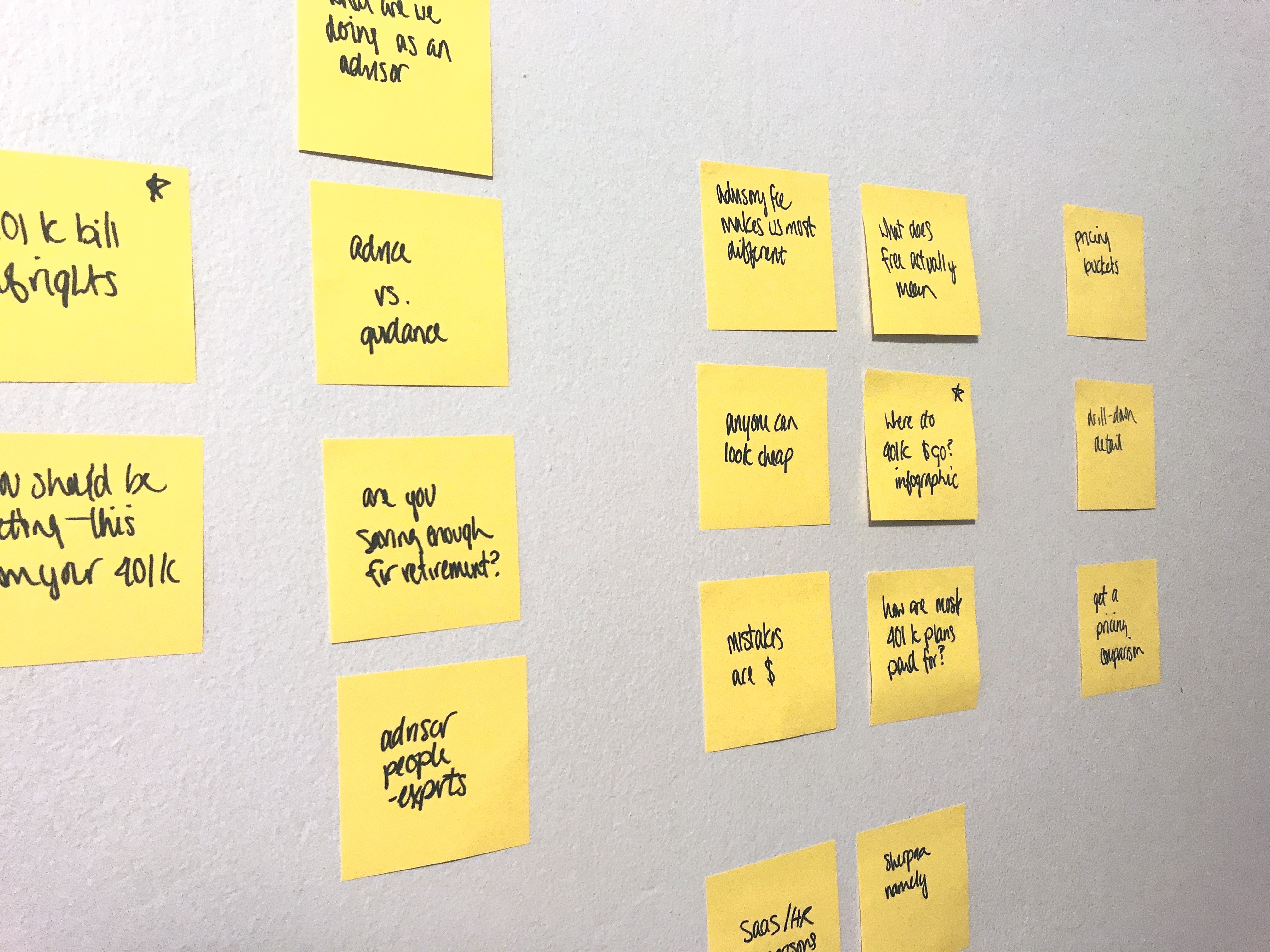
Ideas generated during our first brainstorming session.
We did brainstorming and sketching and eventually landed on the idea of a calculator-style structure, where users could customize their fee in an a-la-carte way. The calculator would have one section for each type of fee, and at the end of the individual fee sections, there would be an all-in section where the individual fees would add up.
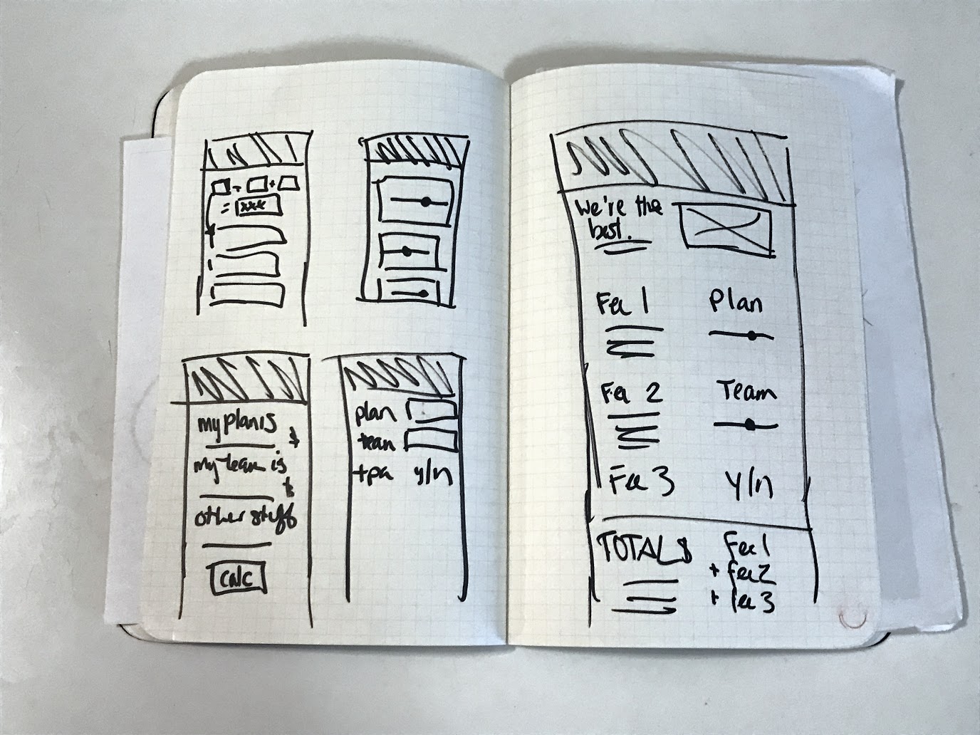
Sketches of a few layout ideas, along with a more detailed exploration of the calculator idea.
There were a few benefits to this structure. First of all, I could break up the information into smaller, more easily digestible chunks. Second, this gave me space to include all the information about why we charge the fee, and what exactly is included. Third, it allowed me to add in interactivity that would make the tool fun to use. And lastly, it allowed us to tell a step-by-step story about what goes into 401(k) pricing and to influence how our customers think about it.
Validation
We made a lot of guesses with this solution that I needed to confirm with actual users. So I set up some follow-up testing sessions with a similar group of decision makers as our original research.
I came up with another set of questions I wanted to answer after watching testers use a prototype version of the calculator:
- Basic comprehension — is this structure and story easy enough to follow?
- Can users understand how their personalized inputs affect the bottom line number?
- What defaults make sense — both to users and from a business perspective?
This project gave me an opportunity to try out a new prototyping tool I’d been hoping to play with, FramerJS. Framer allows you to take a Sketch wireframe and layer real interactive content powered by Javascript on top. The prototype was well received with testers, because the interactivity was real, the numbers were real, and there was no ‘Well, just pretend that other number would change when you click the slider…’ It also was a huge help during the build process (more on that later).
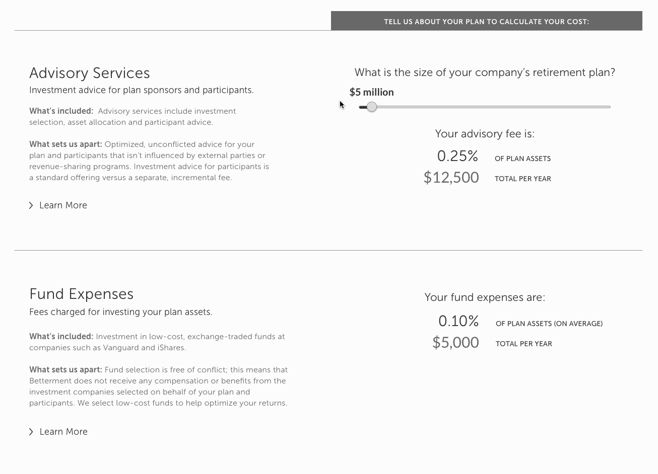
Animation to show how the prototype interaction built in Framer worked.
We got some great feedback from testers. The only structure problem that came up is that users weren’t sure where to start, so we added in instructional copy (which is kind of a cheat, but it worked). We were able to test several different defaults to make sure that we were anchoring with realistic company size data.
We even got some surprising feedback- one tester commented that she really liked the all-in summary, because she could easily take a screenshot and send it to her finance department to review and approve. That was something that I hadn’t considered, but once she mentioned it, it seemed obvious, and I polished that output to make it more shareable.
Implementation
I was also responsible for the build of this project. It was a fairly straightforward HTML+CSS+Javascript implementation, plugged into our WordPress brochure site.
Since I had already built the prototype in Framer, I had already worked out how the slider math should be built in an object-oriented way. I was able to move this over to our Backbone JS framework in a few minutes and have everything just work. It was nice not having to work out the calculations in two different formats.
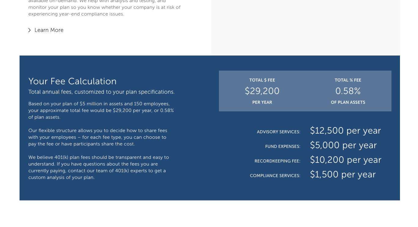
The all-in total cost section, designed to be easily sharable.
It was a really nice change to end up with a build that only took a couple of days because we spent the proper time on testing and prototyping.
Iteration
There were several ideas that came up in either brainstorming or user testing that we saved to our roadmap. It was important for this project to release something simple that worked — we had a press announcement deadline to work with.
We ended up with a list of good ideas on the roadmap to prioritize later:
- We considered gating the final calculation behind an email address input to use as a lead generation tool. We backburnered this both for an efficient build, and because we didn’t have the right followup system in place yet.
- Our sales team suggested a tool for users to submit their current pricing for analysis. This would be great to position our team as 401(k) experts, as well as an avenue to pass a lead along to our sales team.
- A couple users suggested adding a tool to compare our pricing to competitors. We wanted to wait on this until we could do more competitor research and provide a more helpful apples-to-apples comparison.
- I had the idea to have an abbreviated version of the all-in calculator to be always visible on screen, so users could see how to total changed, not just the individual fees. I decided to come back to this at some point after the press launch so I could finish the build with more time for QA.
Takeaways
The biggest win to come out of this project (besides the shiny new calculator!) was the prototyping process. On the one hand, it made the build super efficient since I was able to build once and reuse code. On the other hand, it also made testing incredibly realistic since there was less imagination required on the part of the user. The less work you make your user do, the more willing they will be to go along for the ride.
All information in this case study reflects my thoughts and does not necessarily reflect the views of the company. To comply with my non-disclosure agreement, I have omitted and anonymized confidential information.