Case Study: Home Page Testing
TL;DR
I designed a series of tests on Betterment's home page to increase interest in our new financial expert services and to entice visitors to sign up for these services.
The Problem
As part of an increased focus on marketing, my team was tasked to help increase the number of people who were using our new financial expert services. We thought that the top of the funnel — the home page — was an ideal place to increase awareness.
We also had a window to test some new ideas in the few weeks before we launched a our new brand with an entirely new home page, and we wanted to use these tests to inform what went into that design.
The User
Visitors to our home page are diverse in many ways: investing experience, comfort with technology, knowledge about Betterment, general demographics, etc. In this test, we chose to focus on a couple of our target personas in the hopes that we would attract the types of customers most compatible with us.
The primary user is someone who is comfortable with technology and has a good understanding about investing. But she has no time or desire to do the nitty-gritty work that makes investing most successful, and she wants to know she is making the right decisions across her whole financial picture.
The secondary user is similarly comfortable with technology, but sees investing as too confusing. The only metric she knows to compare is investment returns so she pays close attention to it, and she believes that having an active advisor can drastically improve that number.
Both of these users benefit from Betterment’s automated technology — controlling the complicated details that computers are good at. But they could also both benefit from having someone to talk to about their investments.
In the first case, the customer wants to know that she can talk to someone trustworthy and is getting service personalized for her needs. And in the second case, she needs education on investing to learn what an advisor can and can’t do for her.
Research
The research from this project came out of the prep work for rebranding. Our branding team did thousands of hours of research and interviews with these target customers and came up with a couple common threads.
These customers are comfortable using investing technology if:
- they know there is someone they can talk to if they need to.
- it is designed with input from financial experts
- if it based on their personal information and financial goals
We also incorporated some previous testing into our data. Past split test results showed increased signups when we talked about our financial experts in our messaging. We also had results from messaging tests that identified some specific phrases and copy that resonated with our target customers.
All of this research supported our hypothesis: that we were not doing enough to highlight our financial experts on our home page.
Exploration & Validation
Since this was our main site home page, it was important to get many people involved in the ideation process. I set up sessions with various team members to brainstorm possible directions to take. For each session, I briefed the group on the user and research before we jumped into sketching sessions. After sketching, we voted on which kind of ideas we liked.
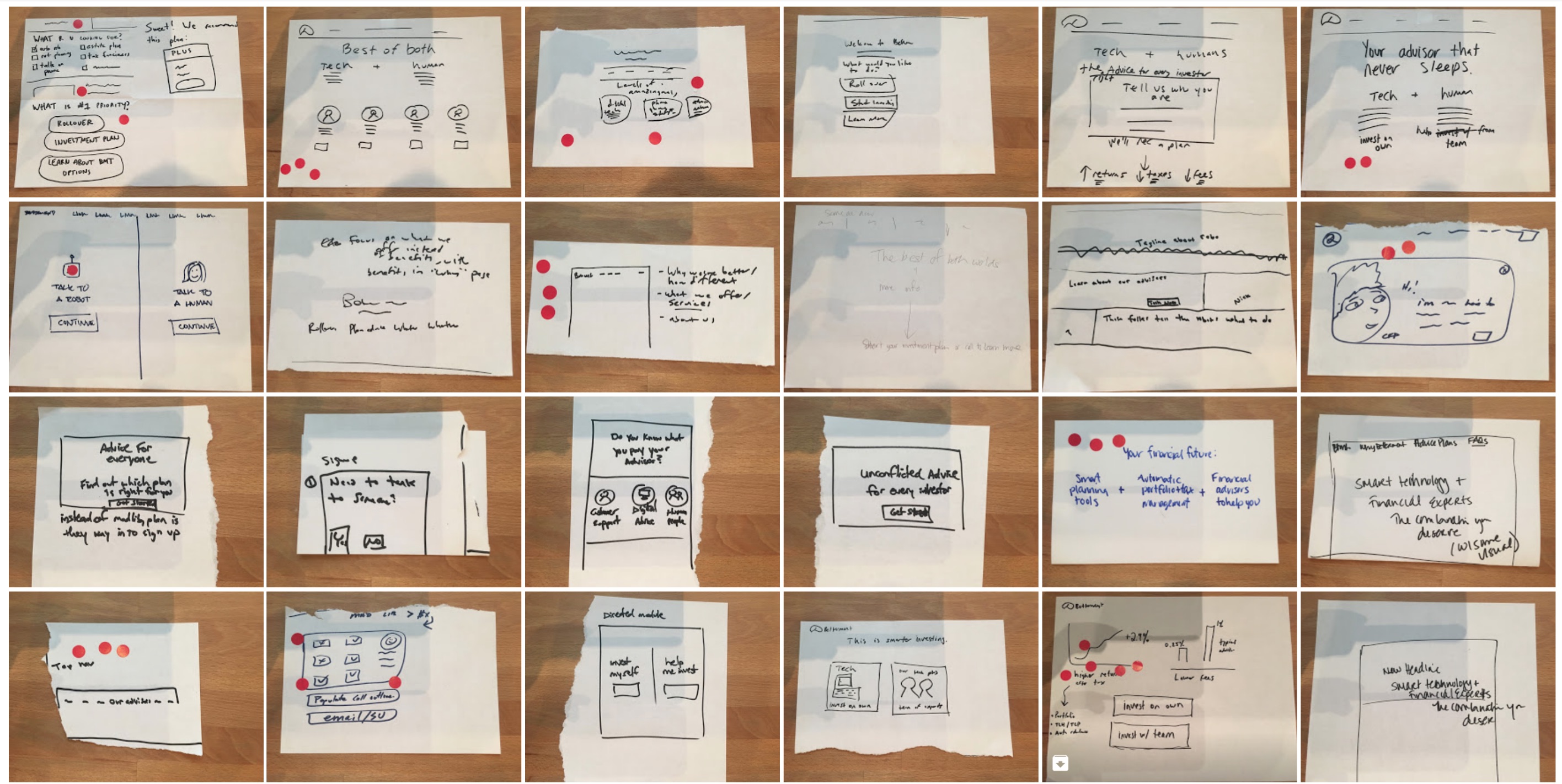
A few of the ideas that came out of the sketching sessions
After sketching and voting, a few patterns emerged that we created two tests around.
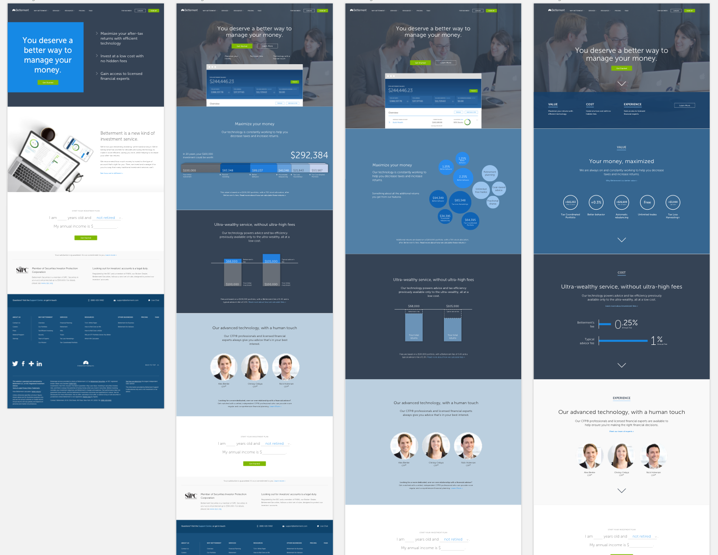
Test 1: Tech + human = best of both worlds
Several of the ideas that came up were based around the idea that humans and technology should combine together to create a successful investment strategy. I worked out a few visual iterations along this line.
We also considered testing this message in a highly focused way — reducing the content and navigation on the site to better emphasize the idea and to encourage visitors to start the signup process ASAP. We ultimately scrapped this part of the test as it didn’t really relate to our hypothesis, and it would make the test more complex to build.
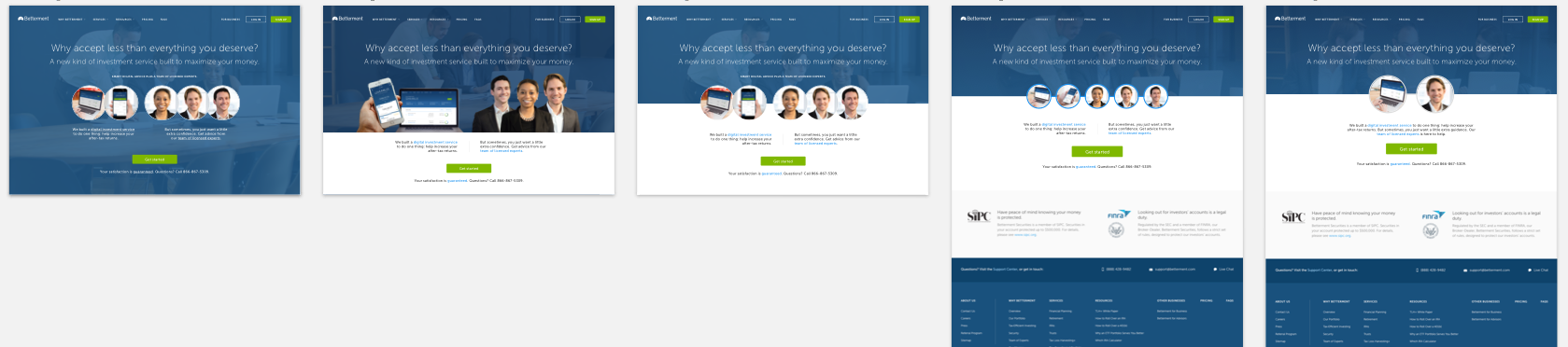
A few of the visual ideas I came up with for test 1
At this point, I brought the ideas back to our key stakeholders. After some discussion, we came to the consensus that the message was cluttered and unclear. The first round of designs seemed to convey a choice to be made, rather than a combination.
Based on this feedback, I went back to the drawing board. I separated the ideas into individual messages that could tell a better story of why the two components were important. These visuals ended up being much simpler, while at the same time reducing the number of variables we were split testing to solve for.
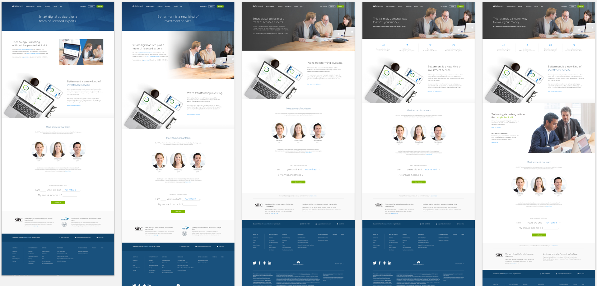
The second round of ideas I came up with for Test 1
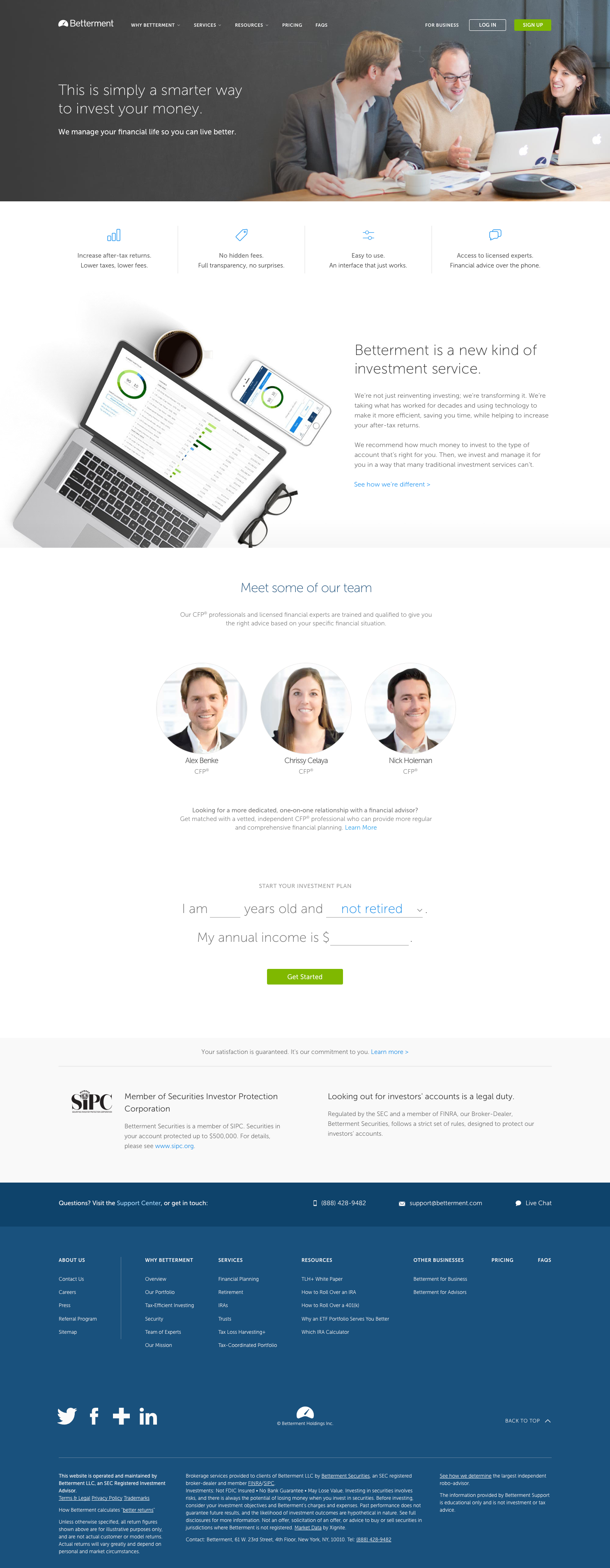
The Test 1 design we ended up shipping
Test 2: Good investing delivers value, low cost, and expertise
While the split for Test 1 ran, we used the time to explore a slightly different message that was somewhere between the Test 1 idea and the benefit-heavy messages we found to be effective in our research.
I incorporated each one of these benefits into a separate section where we could clearly spell out what value we brought to the picture, what our costs were, and who was providing the expertise. One of the big advantages to this structure was that we could incorporate real numbers that showed our value, and real pricing information that directly compared our fee to others.
Some visuals for Test 2
These ideas were all really fun to explore, but there was bad news — we never ended up running this second test for a couple reasons: - The values of the services we provide are all measured differently, and we couldn’t mislead people into thinking they were additive. - We spent too much time looking for ways to calculate those values fairly, so we ran out of time to get results before our rebranding deadline.
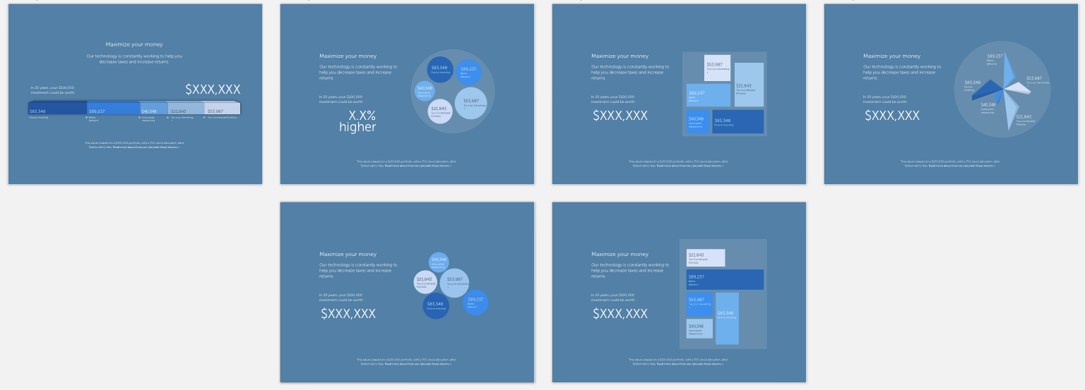
I did get to play with some fun ideas for visualizing the value section, though.
Testing
While we were iterating on the design, we were running tests on usertesting.com. The goal of the tests was to make sure the testers understood that we offered advice from human financial experts. We constantly tweaked the copy and design to make sure testers were getting the right message.
But the main test for these designs was to see if they improved conversion rate for our financial expert services — our original problem to solve. We used our split testing platform to measure two conversion metrics:
- Customers who scheduled a call with one of our experts
- Overall signup rate (to make sure we didn’t negatively impact it)
The plan was to run each test for two weeks so we could get significance in the results. Only Test 1 got that time, but the results were positive. Emphasizing our team of experts alongside our technology increased the number of calls scheduled significantly, and even had a minor lift to overall signup rates. The branding team was able to incorporate these learnings into their new version of the home page.
Takeaways
We learned about our messaging from this test, but also learned just as much about our testing methodology. It’s really tempting to throw in interesting new ideas, but you need to balance that against the number of variables you are testing. To get that balance, sometimes it makes sense to scrap content, design ideas or whole tests altogether.
It’s important to keep evaluating what you want to learn from your test, whether you can get that information out of the content you’ve created, and if you have the proper amount of time to get significant results.
All information in this case study reflects my thoughts and does not necessarily reflect the views of the company. To comply with my non-disclosure agreement, I have omitted and anonymized confidential information.